Space
Space Exploration
Near Future
“Space” is a science fiction-based theme introduced in 1978 by LEGO, featuring astronauts, robots, space vehicles and bases.
Overview: The LEGO Space Logo
Analysis: History and Logo Usage
Before getting into the details of the logo and its application, I’d like to provide a bit of context for LEGO’s Space System and the Space visual identity. This will help us to understand the mark’s usage and ultimate fate, as LEGO’s product line evolved over time.
In the year 1964, the LEGO Group offered their toy bricks as a set for building a “Space Rocket,” capitalizing on public interest generated by the Space Race that was going on between the United States and the Soviet Union. It was a simple red, white and blue design, with no graphics applied.
Years passed after this, and then in the early 1970s, they released two more space sets — one for a “Rocket Base” and the other for the “Moon Landing.” In the Rocket Base, the LEGOLAND® logotype was applied to a small truck, and that was the extent of the graphics. But in the Moon Landing, we see the American flag applied to the lunar lander and the chests of the blocky astronaut figures (Figure 1.1) — a precursor to future application of the Space logo in LEGO sets.
All of these were one-off sets, released under their LEGOLAND product line, which also included sets for buildings, towns, cars, trains, etc. Then, in 1978 things got interesting.
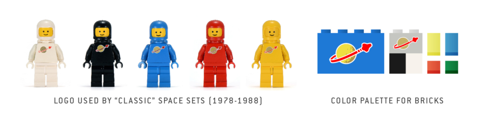
This was the year LEGO introduced a new business model, which company owner Kjeld Kirk Kristiansen touted as the “System within the System.” It marked the beginning of different play-themed LEGO worlds within the LEGOLAND product line, starting with LEGOLAND Town, LEGOLAND Castle and LEGOLAND Space. It was also the year they introduced the smiling yellow LEGO minifigure, as we know them today.
As described on LEGO’s history site, the earliest Space System sets were “spaceships, lunar bases, rockets and rovers,” which were “inspired by the real space technology of the 1960s and 1970s.” That said, these sets were decidedly more science fiction than their earlier LEGO predecessors, not just depicting existing technology, but optimistically imagining a future with an expanded and routine human presence in space. LEGO’s new minifigure also took the form of astronauts, in colorful suits and helmets. And on all of these things within the LEGOLAND Space theme, there was an identifying symbol tying everything together — the now iconic LEGO Space logo, with its red spaceship circling around a moon.
There’s a lot of great info on the LEGO History site, and it states there that the Space theme was almost entirely designed by Jens Nygaard Knudsen (set designer from 1968–2000), one of the few designers LEGO had at the time. So he came up with the predominantly blue and gray color palette used in Space System sets. In addition to all that, he was the creator of the articulated yellow minifigure, that was used across all themes.
As for the Space logo, this was created by another designer on the Space theme team. Jens is interviewed in an article that appeared in Brick Journal, where he states, “The Space logo was made by Hjalmar Nielsen, his first version had a lot of stars around it too, and was beautiful, but this was considered too flashy so the stars were removed!”
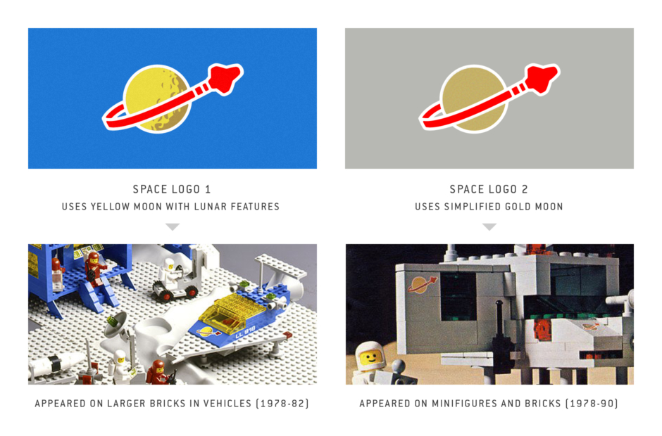
In the beginning, the Space logo appeared in two versions. The larger of the two, that would appear on space vehicles (Figure 1.2), used a yellow moon with lunar surface features detailed on the shaded right side. The smaller, which was also featured on vehicles, and on the front of the astronaut minifigures’ torsos (Figure 1.3), required a simplified mark for reduced size application. That meant subtracting the lunar details and shading, and representing the moon with a solid-fill circle. And instead of the yellow, they opted for metallic gold. In both cases, the red spaceship and trailing orbital path encircling the moon remains the same. Outlining all of the elements is a white border, to ensure proper contrast with whatever surface the logo is applied upon.
After 1982, LEGO ceased use of the more detailed yellow moon version, and the simplified version became the sole mark representing space explorers from the “Classic” era sets. They also abandoned the “LL” number designations they applied to some of the space vehicles.
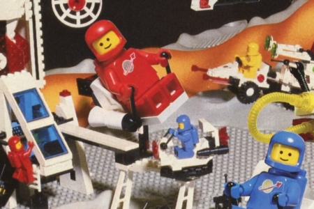
The different colors that the original Space minifigures appeared in, were released over time. While there was no official story assigning roles to the different colors, according to Jens Nygaard Knudsen, "the red and white spacemen started as Cosmonauts and Astronauts. Later they became red pilots and white explorers, yellow were introduced as scientists, blue as security/soldiers, black as spies."
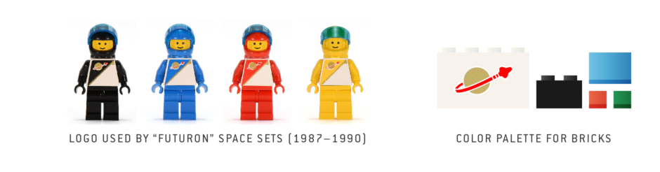
With a small amount of overlap, “Classic” Space was phased out in 1988, and in 1987 new factions emerged within the theme, each with their own specific identities (Figure 1.4). Prior to this, space was a relatively peaceful and non-antagonistic place for kids to explore with LEGO toys. Then we got what appeared to be a good side in the form of the Futuron, and a bad side with the Blacktron, though it wasn’t explicitly stated as such (being a kid at the time, Blacktron was my chosen faction, because they looked so damn cool). This was followed shortly after by the introduction of Space Police, and an official storyline making the Blacktron bad… which also got the Blacktron figures included in Space Police sets, as occupants of holding cells (I guess I picked the wrong side, but no regrets!).
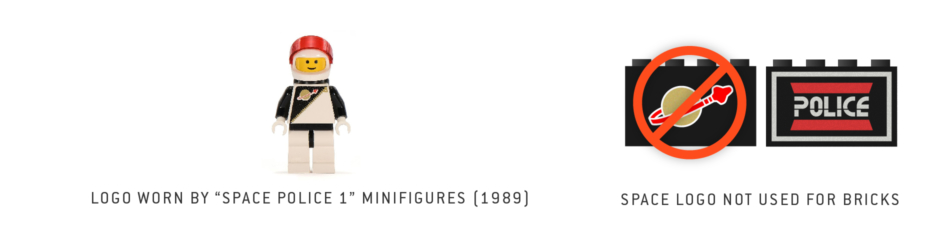
The factions were largely set apart by their sets’ overall color schemes (see the Overview), but the Futuron and the Space Police still shared the original Space logo as a common element. Both wore the mark on their space suits, and some but not all of Futuron’s vehicles bore the mark (Figure 1.5). Space Police vehicles didn’t use it at all (Figure 1.6), and it wasn’t long before their overall visual identity evolved beyond the logo’s use altogether, becoming what are known as “Space Police II” sets. The Futuron would be phased out in 1990, replaced by increasingly specialized factions that merited equally specialized logos — M-Tron, Ice Planet, Spyrius, etc — thus marking the end of the original Space logo’s use within the Space System.
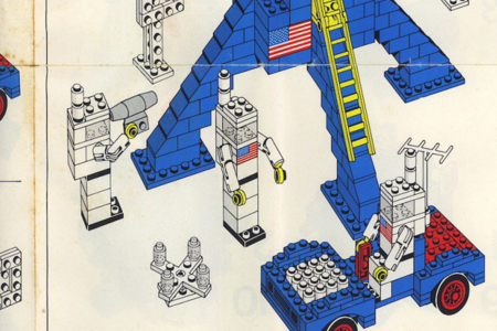
Figure 1.1 In the 1976 “Moon Landing” set, we see the US flag used in a manner similar to what we’ll later see with the Space logo.
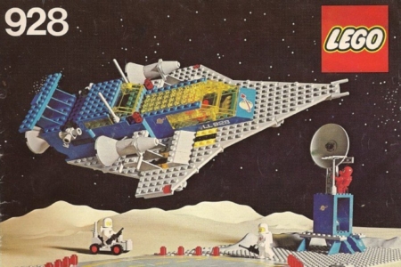
Figure 1.2 A set from the “Classic” Space era, which uses the large yellow moon version on the front, and features an LL designation on the side.
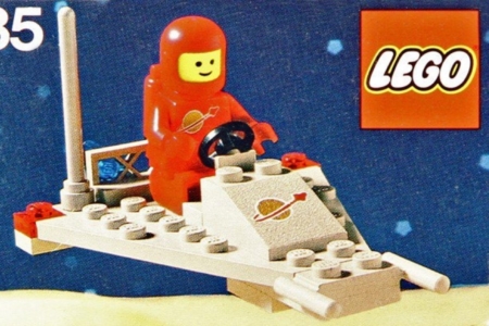
Figure 1.3 Classic Space also used a version of the logo with a simplified moon, applied to smaller bricks and worn on the front of space suits.
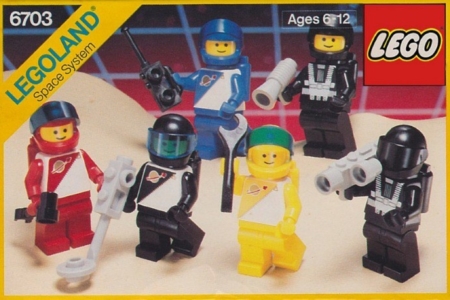
Figure 1.4 In 1987, factions emerge within the Space System, but the good side known as Futuron still wears the Space logo on the front of suits.
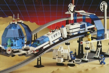
Figure 1.5 The Futuron were the last to use the Space logo on bricks, but not in all sets. It was their specific color scheme, of white and black bricks, and blue glass, that really identified their specific vehicles and bases as Futuron.
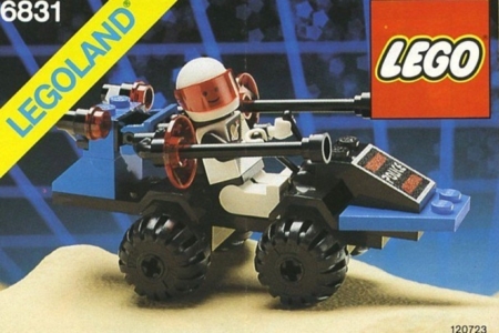
Figure 1.6 The Space Police borrowed the look of their space suits from the Futuron, which featured the Space logo, but they had their own logotype for identifying vehicles and bases with their faction.
“There is a lot of NASA DNA in LEGO Space…” —Bjarne Tveskov, LEGO Space Set Designer, Bricks Culture
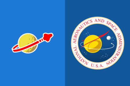
Figure 2.1 The 1978 LEGO Space logo (left) is very likely inspired by the original 1959 NASA logo (right), referred to and still used formally as the “NASA Seal” at present.
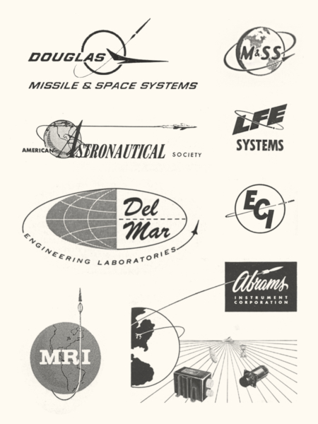
Figure 2.2 Examples of logos featuring orbiting spacecraft, found in Space Age commercial advertising.
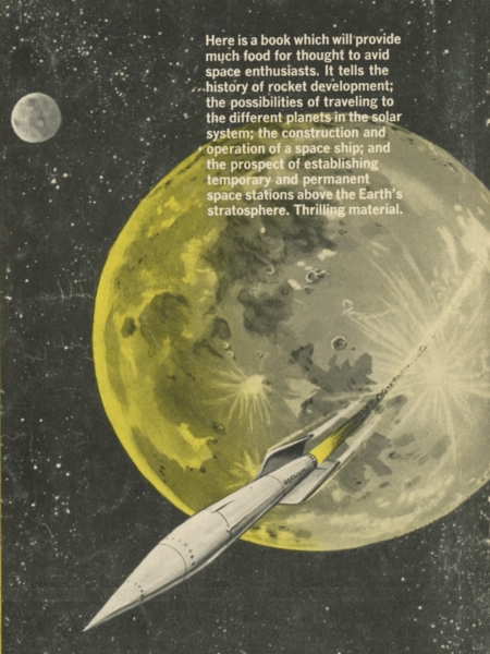
Figure 2.3 From the back cover of the 1954 book Going Into Space by Arthur C. Clarke, an illustration of a rocket rounding the face of a yellow moon. Imagery of this nature is a popular Space Age motif.
Analysis: Design and Inspiration
Designed and introduced in 1978, I believe the now iconic LEGO Space logo likely owes a lot to another iconic space identity — that being the logo for the National Aeronautics and Space Administration, or NASA. Specifically, the official seal for NASA, which was the basis for the NASA “Meatball” insignia that serves as their primary logo. Both of these NASA symbols were designed in 1959 by James Modarelli, in cooperation with the Army Heraldic Branch, for the newly established space agency. So by the time LEGO designer Hjalmar Nielsen was working up the Space logo close to two decades later, he and most everyone who cared about space exploration would have been well aware of this mark.
First examining the NASA Seal (Figure 2.1, right), we see the mark depicts a yellow sphere, representing the planet Earth, enveloped by a stylized version of a NACA-designed “theoretical wing configuration” in red, and encircled by a space vehicle’s elliptical orbit path in white. To the right, the smaller white sphere represents the Moon, with all of this set against a dark blue field containing distant white stars, representing outer space.
Turning to the LEGO Space logo (Figure 2.1, left), we see it also uses a yellow sphere as a primary element, though its features indicate a lunar body. Encircling the yellow moon, is a space vehicle’s elliptical orbit path, very similar to what we see in NASA’s marks. The spacecraft is larger and more distinguishable in shape though, compared to what was used in the NASA logos. I feel like it bears some resemblance to the Space Shuttle, which was being developed in the 1970s. Rather than using white as NASA did, these elements are red in the Space logo, which looks to be borrowed from the red cambered arrow wing in NASA’s. The angle of the orbital path seems to borrow from the wing element as well. Placed side-by-side for comparison, the similarities are pretty striking, despite each being different enough to avoid any confusion. It really adds to the LEGO Space logo’s charm, that it seems to give a nod to NASA’s original mark.
Each in their own way uses white as a border, as a functional requirement. In the case of NASA’s, it was fulfilling the requirement that all official government seals appear in a circular shape. This usually involves an outer ring enclosing words, and many times it is a white ring. For LEGO’s Space logo, the white border, or outline, would be required to make the mark stand out and remain legible against any color of toy brick or minifigure it may live on, which would include the colors red and yellow.
Coincidentally, the NASA Seal uses the color blue, which is something the LEGO Space logo itself lacks, but is a major part of the original “Classic” space visual identity. While the simplified version of the Space logo lived on many LEGO colors, the yellow moon version that so closely resembles the NASA Seal only lived on blue bricks. So really, LEGO’s yellow planetary body always floats in blue space, just as the yellow planetary body in NASA’s Seal floats in a blue outer space. As noted, this is probably a coincidence. I’ve read that LEGO designer Jens Nygaard Knudsen chose blue from the existing lego plastic colors he had to work with, and did so due to its technical look and feel, especially when paired with gray. But in early stages of the LEGO Space logo's design, Hjalmar Nielsen had included a star field, which was deemed "too flashy" to include in the end. So it came very close to looking even more like the NASA Seal, which included stars against its blue backdrop of space.
And it’s possible I’m wrong about all of the similarities and the influence from NASA’s mark. That said, the LEGO Space logo design would still be treading common ground with NASA’s, using the elements it did to create the symbol — even NASA's design ran into comparisons when it was first submitted to the government’s fine arts commission. That commission only reluctantly approved the design, stating as part of their reluctance that it was “very reminiscent of designs appearing in current commercial advertising.” A rightful concern to have, as a logo should strive for originality in most cases, so it is something that can be owned as an identity. And as a person can see by browsing commercial advertising material from the Space Age, this is a trend that would only continue to increase (Figure 2.2), with designs featuring rockets and spacecraft in orbit running rampant.
But for the LEGO Space logo, it makes even more sense with all that in mind, because of what they were doing and who their audience was. They needed a mark to represent a toy that children not only played with as explorers of space, but also used to imagine and construct their own fantastic visions of the Space Age technology that would take them there. And that didn't require an original mark, so much as one that would call to mind the efforts of those real aerospace companies and America’s space agency NASA, who were striving for and hoping to invoke a seemingly science fiction future with their own identities, ads and campaigns of the time. It also took a popular Space Age motif that children were no doubt very familiar with from the covers of science fiction pulps and comics (Figure 2.3), and other sources depicting space in popular culture, and made it into a simple, unforgettable symbol for their very own “space program” made possible by LEGO.