Voight-Kampff
Detector, Device, Procedure
Year 2019
The Voight-Kampff test, also referred to as the V-K, was an interrogation procedure used by special police officers known as Blade Runners, to determine if a suspect was human or Replicant. The test involved the use of a V-K machine, which measured involuntary empathic responses in the test subject — specific changes in respiration, blush response, heart rate and eye movement — as the Blade Runner posed prescribed scenarios and questions.
Overview: Voight-Kampff Identity
Voight-Kampff: Intro and Application of the Visual Identity
The Voight-Kampff test, also referred to as the V-K, was an interrogation procedure used by special police officers known as Blade Runners, to determine if a suspect was human or Replicant. It is similar to the real-world polygraph. In the film, we see Holden and Deckard perform the test in two separate situations.
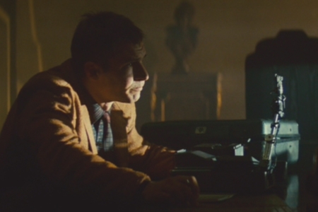
We first see the V-K machine in the scene were Holden is interrogating Leon at Tyrell Corp. Here we get a very good look at the machine (Figure 1.1), but not the angles that would allow us to see logo placements.
Later, as Deckard is testing Rachel, we clearly see the logo on the V-K machine’s case (Figure 1.2). I’ve seen comments from fans that it might be Tyrell’s logo on the case, but this doesn’t make any sense. Realistically, the device’s case would carry the manufacturer’s logo, and the way Tyrell questions Deckard about it, he only seems passingly familiar with the test — there is no reason to believe the V-K was a product of Tyrell Corp.
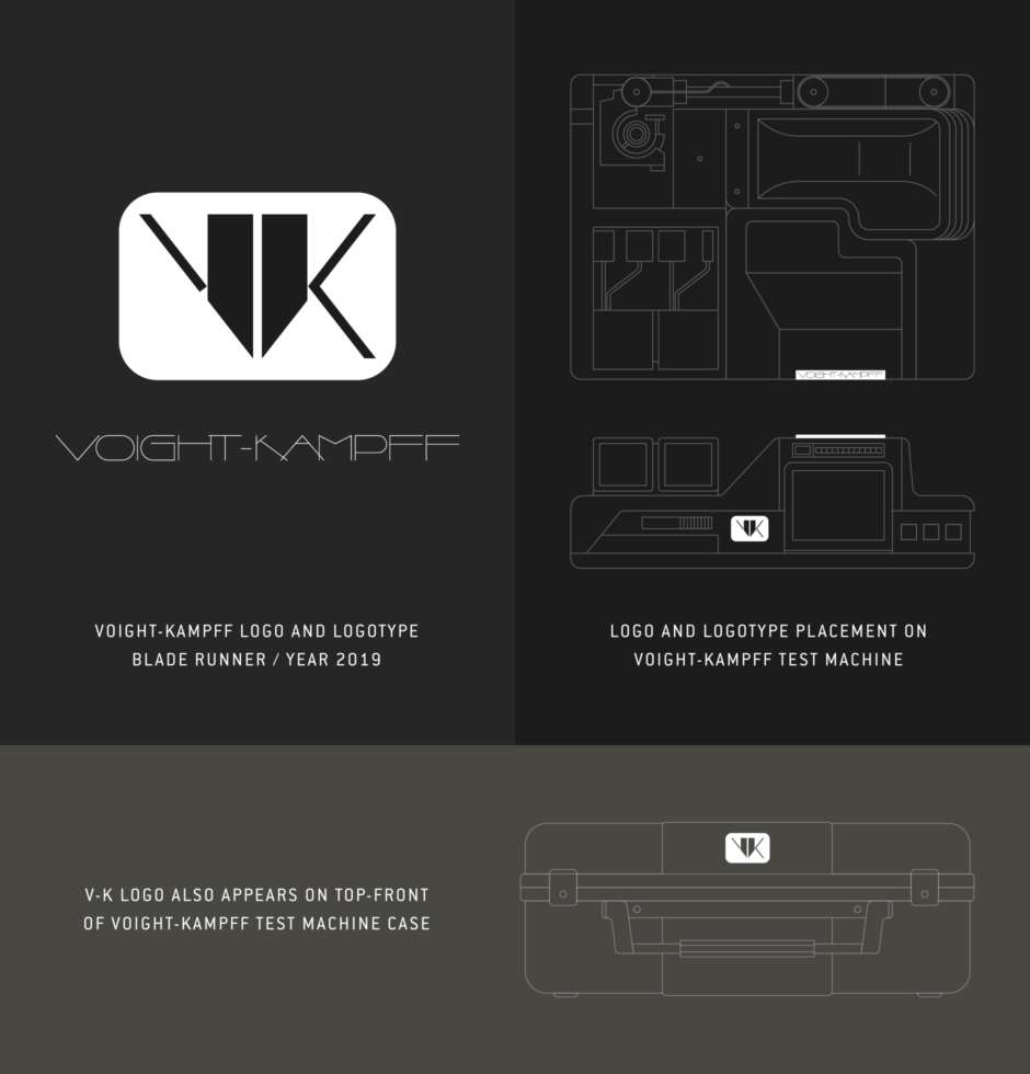
We also see other angles of the machine in these scenes with Deckard, Rachel and Tyrell. Unfortunately, it is still too dark to make anything out for certain, so I relied on Tom Southwell’s photos of the prop, shared in a Propsummit: The Art of Blade Runner forum. In those, we find marks in two places (Figure 1.3) — the V-K logo is on the back interface to the left of the main screen, and the Voight-Kampff logotype appears on a plate attached to the top of that screen, facing up.
I’ll note that in shots that show close-ups of the interface screens, where the rest of the machine is dark and obscured, I tried bringing the brightest of them into Photoshop and applying adjustments (Figure 1.4). This revealed an apparently empty space where the V-K logo plate should have been. I’m not sure what to make of it. I believe there were multiple versions of the prop, so they may not have been exactly the same.
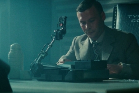
Figure 1.1 The Voight-Kampff test machine, in the scene where Holden interrogates Leon at Tyrell Corp.
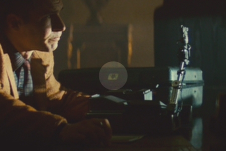
Figure 1.2 As Deckard begins to question Rachel, we can see the V-K logo on the case in the background, in the highlighted area.
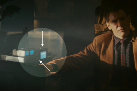
Figure 1.3 In this shot, you can just barely see the two plates that the logos appeared on, in the area I’ve highlighted.
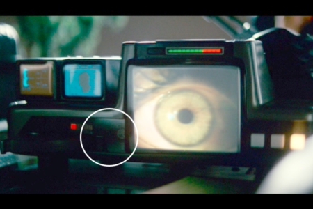
Figure 1.4 In this shot, where I’ve brightened the image, the V-K logo appears to be missing from the machine.
Analysis: The V-K Logo Design
The Voight-Kampff visual identity was designed by Tom Southwell, who worked as a production illustrator for Blade Runner. In the documentary film, Signs of the Times, we get to see the V-K logo sketch followed by the finished mark (Figures 2.1 and 2.2). Interestingly, there was a tagline under the sketch, stating “It takes one to know one.” This could imply that it takes a machine to detect a machine. But reading into it, it could also give away too much about Deckard’s true nature, and for that reason Ridley Scott didn’t approve the tagline’s use in the film or promotional materials.
The V-K logo is a modern-styled monogram mark composed of mirrored geometry, where the V is defined by the absence of the K’s lower leg. This mirroring calls to mind the fact that the V-K is a test that reveals a small difference between human and Replicant, who otherwise look exactly the same. It’s also a very mechanical mark, employing enough sharp angles to make it unfriendly and intimidating, which is suiting for a device used in police interrogations with life and death results.
In a Propsummit: The Art of Blade Runner forum, Tom Southwell elaborates on the design and its deeper meaning:
“When I was done and I looked back at the work, I was struck by how many logos were triangles standing on their point. Perhaps I was unconsciously picturing a knife being balanced on its tip by a finger. Not sure. It caught me by surprise. Spinner logo, Vid Phon, VK, Tyrell T. And I think there are a lot more . (Oh ,yeah, that V8 at the top of this page.)
And since you all try to find reasons in all these symbols I need to share one. About a year ago I was digging through the images on Googles BR pages I found my VK logo. And beside it was a lovely photo of a woman's panties as her skirt was lifted. A fine line of lace went down the middle of the panties. It seemed to me someone grasped the hidden meaning in my VK logo. Replicants don't enter life through the same portal as you and me. And this VK device created by Philip K Dick was the only way to know one. I had never told anyone the thought and figured it didn't reach anyone...
Until I saw that photo.”
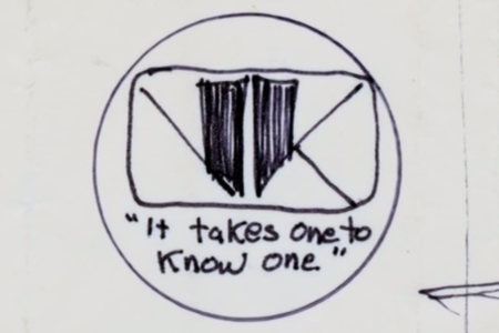
Figure 2.1 Tom Southwell’s sketch for the V-K logo design. Source: Signs of the Times (2007)
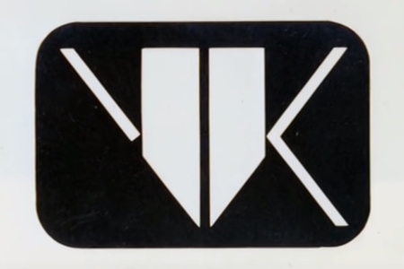
Figure 2.2 The final V-K logo design by Tom Southwell. Source: Signs of the Times (2007)
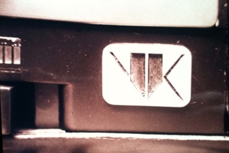
Figure 2.3 The final V-K logo as it appeared on the face of the machine prop. Source: Propsummit, Photo by Tom Southwell
Analysis: The Voight-Kampff Logotype Design
The Voight-Kampff logotype, which appears on the top of the V-K machine, was rendered in a hairline geometric sans-serif with very tight kerning (Figure 3.1).
Tom Southwell notes that the name was mentioned in both the novel by Philip K Dick and in the screenplay for Blade Runner. As he explains it, “It said the name was ‘finely etched’ and I took this to mean like a medical instrument created by Germans. It was a headline font printed by a typehouse custom for me, perhaps one inch high. As usual I got out a razor blade and cut out most of the space between the letters and made a ‘right reading’ 3D plate.”
This custom extended type, with its high crossbars and mechanical curves, has a very Art Deco look to it. It fits well with the Blade Runner Art Deco set designs, and overall Film Noir look and feel.
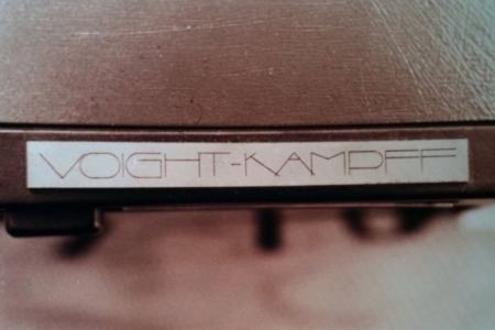
Figure 3.1 The Voight-Kampff logotype as it appeared on the top of the machine prop. Source: Propsummit, Photo by Tom Southwell
The V-K Identity on Blade Runner Merchandise
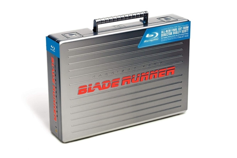
Figure 3.1 The Voight-Kampff logo and logotype appeared in a stacked lockup, embossed above the handle on a metallic briefcase containing the 5-Disc Collector’s Edition of Blade Runner (2007). Source: Amazon
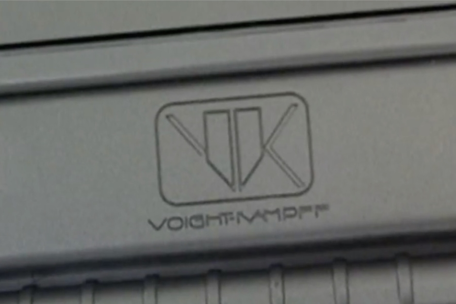
Figure 3.2 A closer look at the Voight-Kampff logo lockup as it appeared on the Collector's Edition briefcase. Source: Blade Runner - Collector's Edition Briefcase Set Review by Zaranyzerak, YouTube (2009)
Source: The Craft of Production Design
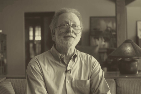
The Designer: Tom Southwell
Tom Southwell has worked in virtually every position in the cinema art department, where over the course of 46 years he has had a hand in major feature productions such as Blade Runner, The Goonies, City Slickers, I Am Number Four, Arachnophobia, X-Men, Mission Impossible, and The Godfather Part II — just to name a few of the over 150 film projects on his resume.
Of his time as a production illustrator on Blade Runner, he is quoted in Paul M Sammon’s book Future Noir, as follows:
“Many people lost their significant other during this film. Long hours away from home can do that. Many people left the project in a storm of loud shouting. But for me it was the assignment to die for (not over). I was given a huge task and I jumped right in and attacked it with joy and vengeance. This was a juicy project. I could use so much of what I learned at art school. Here I am showing my work to Ridley Scott! Wow! I feel that when you come face to face with real genius, you walk away with your pockets full. We had lots of geniuses on BR, so I took trunks of ideas home every night. So many that not all of them made it into the film. I dip into that trunk still.”
Knowing how lucky he has been to have worked on films like Blade Runner, Southwell is now focusing on teaching, to pass on what he has learned to a new generation of artists and designers. You can learn more about his career and where he is taking things, in the 2018 film The Craft of Production Design, which is a great five minute short documentary created by former students of Southwell.
To learn more, visit:
The Craft of Production Design (2018 film) on Vimeo
Tom Southwell’s Filmography on IMDb
View more identities designed by Tom Southwell